Great album cover art
Posted: Mar 08, 2024 3:20 am
The only thing I really miss from Vinyl.
I've just been listening to The Police, and was so struck by the cover of their Ghost In The Machine cover art. Embarrasingly, despite it being extremely striking I don't think I ever once bothered to think about it (in my defence I never owned this album)
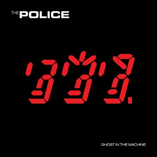
Of course I looked at it for a few seconds 40 years later and suddenly saw it clear as day. And thought "genius".
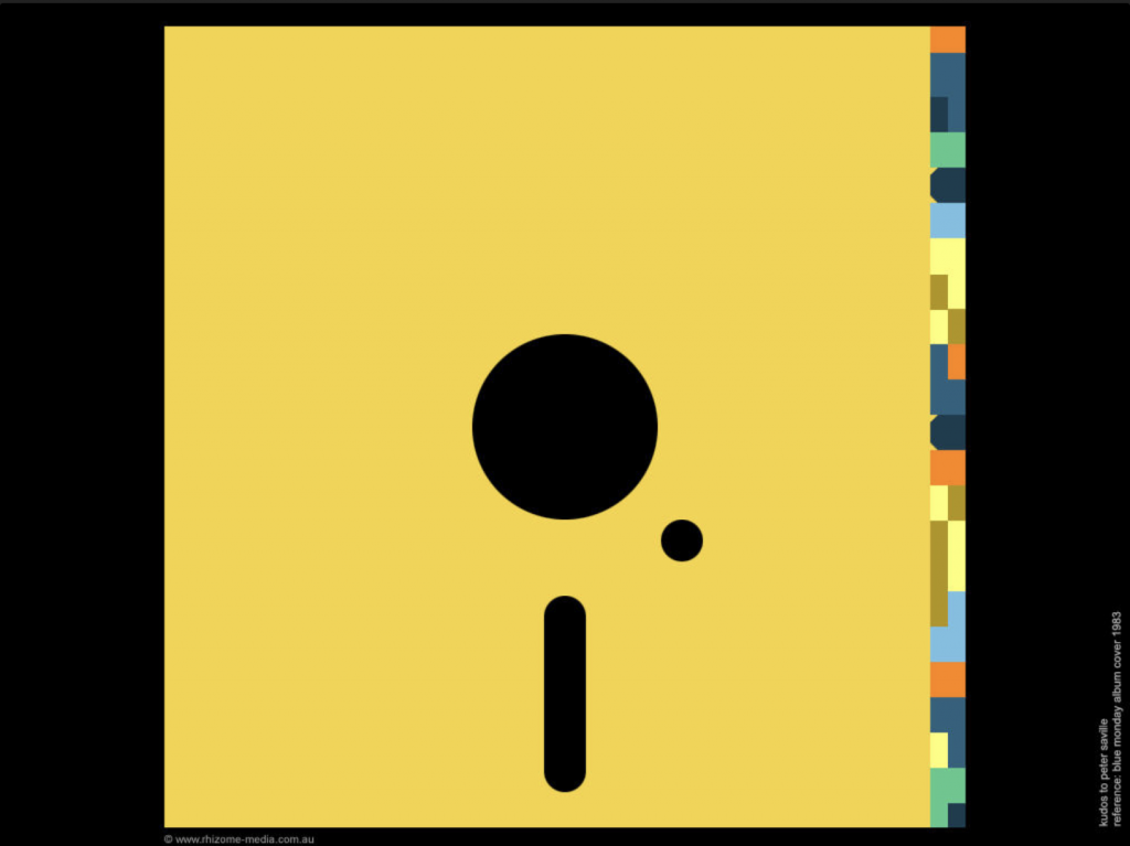
Probably the first designer that comes to mind on the subject is Peter Saville, who was one of the brians behind Factory Records in the UK which spawned a whole factory of iconic designs, none more influential than Joy Division's Unknown Pleasures:
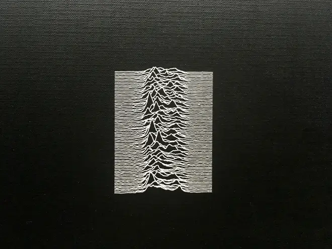
1980. The lead female character in Speilberg's sci-fi Ready Player One was still wearing this as a T-Shirt in 2045 (whose appropriation kinda irritated me but there we go). It's not Fairlight CMI fourier analysis as I always assumed, but the radio signal of a Pulsar. I don't really know what that says about anything to do with the actual record, but it does look cool.
But the designer who had the most impact on me was Michael Granger. His painting, Oxygene, was bought by Charlotte Rampling, Jean Michel Jarre's wife, and so became immortalised by not just the artwork but the name itself.

Now that's one arresting image and arguably more relevant today than in 1976. Even thick 10 year old me couldn't miss its meaning.
Jarre's follow up Equinoxe always fascinated and disturbed me too. Creepy as hell.
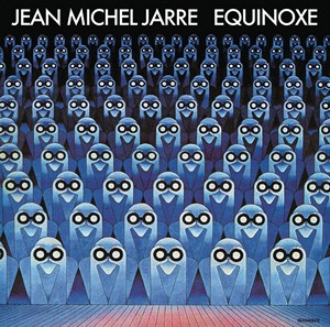
(incidentally, looking at the two now - why the minor typeface change on the slants?)
Amid the many iconic covers much clebrated and discussed over the years - Nirvana's Never Mind, The Beatles Abbey Road - which ones did you keep staring at as you grew up?
I've just been listening to The Police, and was so struck by the cover of their Ghost In The Machine cover art. Embarrasingly, despite it being extremely striking I don't think I ever once bothered to think about it (in my defence I never owned this album)
Of course I looked at it for a few seconds 40 years later and suddenly saw it clear as day. And thought "genius".
Probably the first designer that comes to mind on the subject is Peter Saville, who was one of the brians behind Factory Records in the UK which spawned a whole factory of iconic designs, none more influential than Joy Division's Unknown Pleasures:
1980. The lead female character in Speilberg's sci-fi Ready Player One was still wearing this as a T-Shirt in 2045 (whose appropriation kinda irritated me but there we go). It's not Fairlight CMI fourier analysis as I always assumed, but the radio signal of a Pulsar. I don't really know what that says about anything to do with the actual record, but it does look cool.
But the designer who had the most impact on me was Michael Granger. His painting, Oxygene, was bought by Charlotte Rampling, Jean Michel Jarre's wife, and so became immortalised by not just the artwork but the name itself.
Now that's one arresting image and arguably more relevant today than in 1976. Even thick 10 year old me couldn't miss its meaning.
Jarre's follow up Equinoxe always fascinated and disturbed me too. Creepy as hell.
(incidentally, looking at the two now - why the minor typeface change on the slants?)
Amid the many iconic covers much clebrated and discussed over the years - Nirvana's Never Mind, The Beatles Abbey Road - which ones did you keep staring at as you grew up?